
Hong Kong moves fast. From MTR platforms and bus stops to footbridges and shopping mall escalators, people are constantly moving through the city, scanning their surroundings without spending more than a few seconds looking at any single advertisement.
For Out-of-Home (OOH) advertising, those few seconds can determine whether your campaign gets noticed—or completely ignored.
Industry research suggests that roadside advertising may have only a few seconds to make an effective impression. This means that even if a brand invests tens or hundreds of thousands of Hong Kong dollars in outdoor media, the campaign’s success still depends heavily on whether the creative can communicate its message instantly.
A well-designed OOH ad can make your brand memorable at a glance. A cluttered or poorly structured design, however, can waste even the biggest media budget.
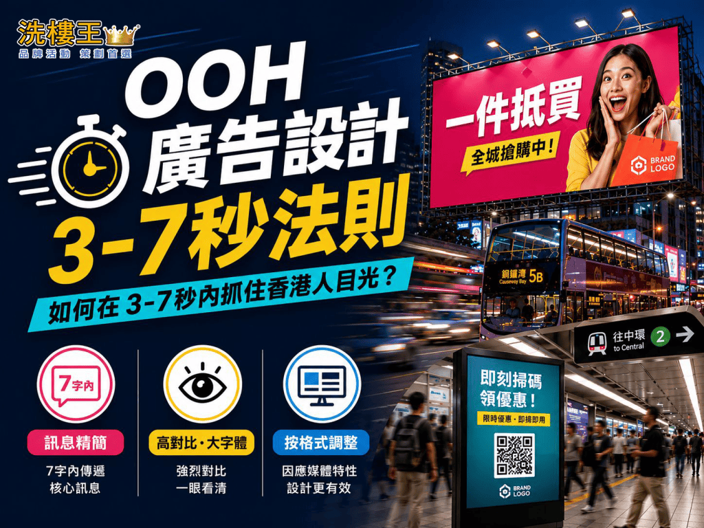
This is the idea behind the 3–7 Second Rule.
In this guide, we explore the essential OOH advertising design principles Hong Kong brands should follow when creating billboards, lightbox advertising, MTR advertising and Digital Out-of-Home (DOOH) campaigns.
Principle 1: Keep Your Message Extremely Simple — The Seven-Word Rule
One of the biggest differences between OOH advertising and social media or website content is simple: your audience does not have time to read.
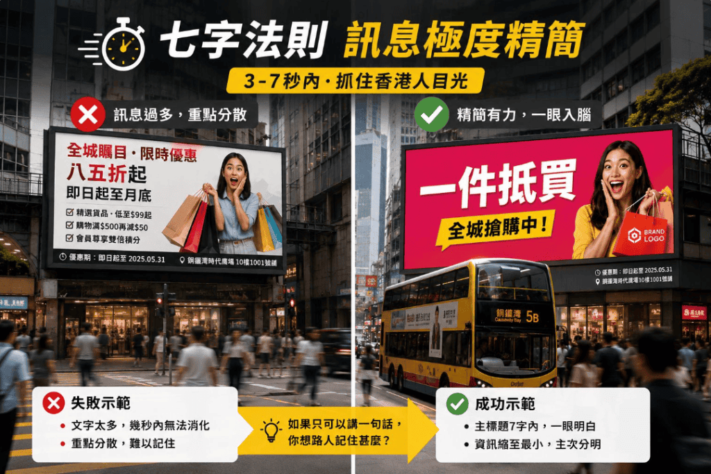
A commonly used guideline in outdoor advertising is the Seven-Word Rule—keeping the main headline to around seven words or fewer and communicating only one core message.
Rather than treating seven words as a strict limit, think of it as a useful creative discipline. People viewing outdoor advertising are often walking, commuting or travelling in a vehicle, which means they have very limited time to process information.
This becomes even more important in Hong Kong, where advertising copy frequently mixes Chinese and English. Chinese characters can communicate information efficiently, but once English brand names, slogans, prices and promotional details are added, an apparently simple advertisement can quickly become overloaded.
For example:
Too complicated:
“Citywide promotion — up to 15% off for a limited time, available from today until the end of the month.”
There are too many messages competing for attention.
Compare that with:
“Best Value.”
“Shop Now.”
“Limited Offer.”
A short headline combined with a strong visual is far easier to understand and remember within a few seconds.
When developing an OOH campaign, ask one question:
If people could remember only one thing from this advertisement, what should it be?
That answer should become your headline.
Supporting information such as prices, dates, addresses and terms should remain secondary. Keep them smaller and position them away from the main visual focus so they support the message rather than compete with it.
Principle 2: Use High Contrast, Large Typography and Clear Visual Hierarchy
Even the shortest headline will fail if people cannot read it quickly.
Colour contrast, typography and visual hierarchy are therefore fundamental to effective outdoor advertising design in Hong Kong.
High-Contrast Colours
Dark backgrounds with light text—or bold, highly saturated colour combinations—can help an advertisement stand out against Hong Kong’s visually crowded streets.
Avoid combinations with insufficient contrast, such as light grey backgrounds with white text. These may look elegant on a designer’s monitor but become extremely difficult to read under direct sunlight, reflections or changing nighttime lighting conditions.
This is particularly important in commercial districts such as Causeway Bay and Mong Kok, where billboards, shop signs, LED displays and lightboxes are constantly competing for attention.
Your creative needs enough visual contrast to cut through that noise.
Large, Readable Typography
Bold sans-serif fonts are generally well suited to OOH advertising because their clean letterforms remain easier to recognise from a distance.
Font size should also reflect the expected viewing distance.
A large billboard or footbridge advertisement viewed from far away requires significantly larger typography. An MTR platform lightbox can accommodate slightly smaller text because passengers are usually closer to the advertisement.
However, readability should always come before aesthetics.
Create One Clear Visual Focus
Effective OOH advertising should have one dominant visual focal point.
The headline, hero image and brand identity should follow an obvious hierarchy so viewers immediately know where to look first.
Your logo should also be clearly visible and placed consistently. Depending on the layout, positions such as the top-left or bottom-right can work well, provided the logo remains easy to identify.
Common OOH design mistakes include:
- Too much copy
- Too many competing fonts
- Logos that are too small
- Weak colour contrast
- Overly complicated background images
- Multiple messages competing for attention
These may appear to be minor design details during production, but once an advertisement is displayed in a real Hong Kong street environment, they can significantly affect campaign performance.

Principle 3: Adapt the Design to Each OOH Advertising Format
Hong Kong offers a wide variety of outdoor advertising formats.
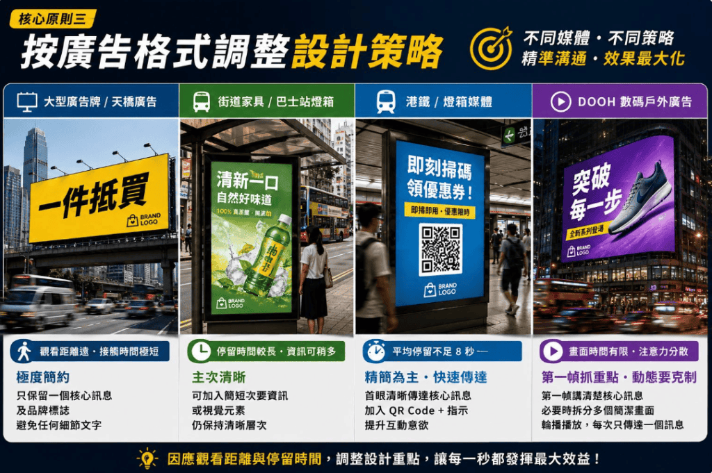
A creative that works perfectly on an MTR platform may perform poorly on a roadside billboard. Instead of applying one design across every placement, brands should adapt their creative according to viewing distance, dwell time and media format.
Large Billboards and Footbridge Advertising
Large-format billboards are usually viewed from a greater distance, while exposure time can be extremely short.
Keep the creative highly simplified.
Ideally, use:
- One core message
- One dominant visual
- A clearly visible brand logo
- Minimal supporting information
Avoid detailed copy that viewers are unlikely to have enough time to read.
Street Furniture and Bus Shelter Advertising
Bus shelter lightboxes and street furniture often benefit from longer dwell times because pedestrians and waiting passengers may remain nearby for several minutes.
This gives brands slightly more room for secondary information or simple visual storytelling.
However, the main headline and visual should still dominate the layout. More viewing time should not become an excuse to overload the advertisement.
MTR and Lightbox Advertising
Hong Kong’s MTR environment moves quickly, with passengers constantly entering trains, changing platforms and walking through stations.
As a result, MTR advertising should still prioritise simplicity.
The main visual and key message should be understandable from the viewer’s first glance.
For placements where passengers have enough time and are physically close enough to interact, brands can consider adding a QR code.
But instead of displaying a QR code without context, give people a clear reason to scan it.
For example:
“Scan Now to Get Your Coupon.”
This immediately communicates the benefit of taking action and can help improve engagement.
DOOH Advertising: Make the First Frame Count
Digital Out-of-Home advertising gives brands motion, animation and multiple frames—but this flexibility creates another common mistake:
Trying to communicate too much.
Do not assume that viewers will watch an entire DOOH sequence.
Your first frame should communicate the core message on its own.
Animation should support the message rather than distract from it. Avoid excessive flashing, complicated transitions or overly rapid scene changes that make the advertisement harder to understand.
If you need to communicate several pieces of information, consider splitting them across multiple simple frames.
Each frame should ideally communicate one complete idea.
Advanced OOH Design Tips for 2026
As Hong Kong’s OOH advertising landscape becomes increasingly digital, brands can go beyond basic readability and use contextual, interactive and shareable creative to attract attention.
Contextual Advertising
Creative that responds to location, weather or time of day can make OOH campaigns feel more immediately relevant.
For example, a brand could promote rainwear or waterproof products during rainy weather, while a food delivery service could highlight fast delivery during peak commuting hours.
DOOH is particularly suitable for this approach because digital creative can potentially change according to real-time or scheduled data.
Create Shareable Visual Moments
Eye-catching outdoor installations and 3D visual effects can encourage pedestrians to photograph an advertisement and share it on social media.
This can extend the campaign beyond its physical media placement and generate additional organic exposure.
For brands targeting younger, socially active audiences in Hong Kong, creating a visually distinctive “Instagrammable” or shareable moment can significantly increase the impact of an OOH campaign.
Use a Clear Call to Action
Whether you use a short URL, branded hashtag, search prompt or QR code, your Call to Action (CTA) should tell viewers exactly what to do next.
More importantly, people should understand what they will gain by taking that action.
Instead of simply saying:
“Scan Here.”
Consider:
“Scan to Get Your Discount.”
The second version gives viewers a clear reason to respond.
Know When to Use QR Codes
QR codes are useful—but they are not suitable for every OOH format.
They work best when viewers are relatively close to the advertisement and have enough time to scan safely, such as:
- Bus shelters
- MTR platform lightboxes
- Shopping mall posters
- Indoor digital displays
- Other high-dwell-time advertising locations
A QR code on a large roadside billboard beside fast-moving traffic is unlikely to be useful. Drivers should not be expected or encouraged to scan a code while driving, and the QR code simply takes up valuable creative space.
Always match the interaction method to the real-world viewing environment.
OOH Advertising Design Checklist
Before sending your creative to print or launching a digital OOH campaign, ask:
- Can someone understand the main message within three seconds?
- Is there enough contrast between the text and background?
- Is the typography large and bold enough for the expected viewing distance?
- Does the advertisement communicate one core idea?
- Is the brand logo clearly visible and easy to recognise?
- Has the creative been adapted for the specific format, such as a billboard, lightbox, MTR placement or DOOH screen?
- If the advertisement includes a QR code or CTA, is it appropriate for the viewing distance and expected dwell time?
If the answer to any of these questions is “no”, the creative may need another round of simplification.
Make Every Second of Your OOH Advertising Count
Great OOH advertising design is only one part of a successful outdoor advertising campaign.
Media location, advertising format, artwork specifications, display schedules and campaign execution are equally important. Even a beautifully designed advertisement with strong typography and clear messaging may underperform if the placement or media format does not match your target audience.
For brands planning an outdoor advertising campaign in Hong Kong, understanding the strengths of different OOH locations and media formats can help you make better use of your advertising budget.
From creative development and media planning to campaign placement and execution, Flyer King (洗樓王) provides one-stop outdoor advertising solutions tailored to your campaign objectives.
Want your outdoor advertising to truly get noticed?|Contact FlyerKing ›