
Why Do Printed Colors Look Different From Your Screen?
Many clients design flyers, posters, or packaging using whatever color file they already have on hand — the colors look bright and vivid on screen, but once printed, the result often looks duller, darker, or noticeably off. This is one of the most common questions clients ask: “The image looked great on my phone — why does it look different once it’s printed?”
The fundamental difference between RGB and CMYK lies in the source of the color: light versus ink. Understanding this distinction is the first step to avoiding unwanted color shifts and keeping your brand colors consistent across every printed piece.
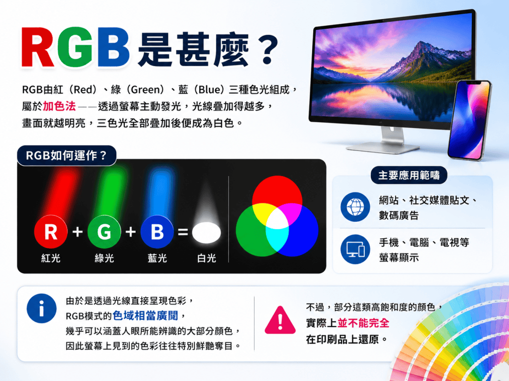
What Is RGB?
RGB is made up of Red, Green, and Blue light. It’s an additive color model, meaning new colors are created by adding primary colors of light together — combine all three at full intensity and you get white.
RGB is mainly used for:
- Websites, social media posts, digital ads
- Phone, computer, and TV screens
RGB is a system based on the physics of white light… by varying the different intensities of these three colors, a digital display can produce millions of vibrant shades. That’s why colors on screen often look especially bright and saturated — but some of that vibrancy simply can’t be reproduced on paper.
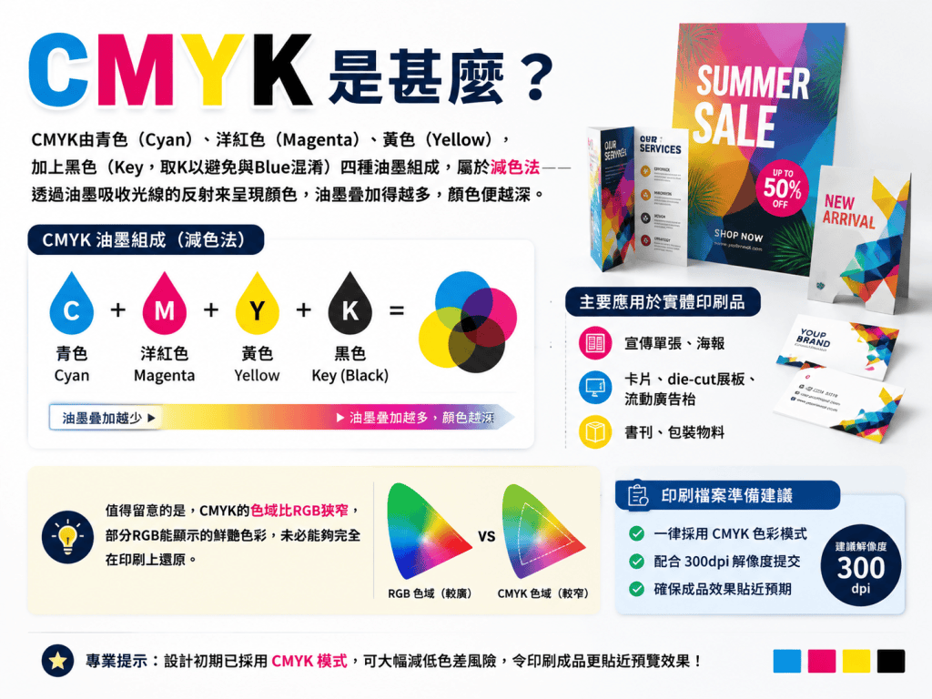
What Is CMYK?
CMYK stands for Cyan, Magenta, Yellow, and Key (black). Unlike the RGB model, which adds light to create colors, CMYK works by subtracting light absorbed by inks. The more ink layered on, the darker the result.
CMYK is the standard for physical printing, including:
- Flyers and posters
- Cards, brochures, and booklets
- Packaging and printed publications
The CMYK color spectrum is smaller than the RGB range… While CMYK colors are remarkably accurate for most photography and branding, they can’t reach the same level of neon “glow” found on a digital screen. For this reason, it’s best to prepare print files in CMYK from the outset, paired with a 300dpi resolution, to keep the final result as close as possible to what you expect.
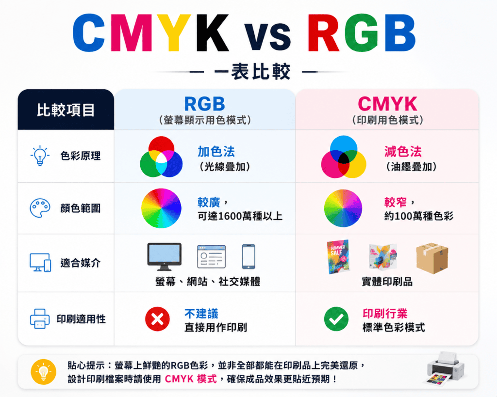
CMYK vs RGB at a Glance
Why Does Converting RGB to CMYK Change the Colors?
This is where most confusion comes from — even when a color technically falls within the CMYK gamut, the final print can still look noticeably different. A few key reasons:
- You cannot accurately reproduce colors outside the CMYK gamut or high contrasting or “neon” colors in print. Bright blues, neon greens, and vivid pinks are especially prone to looking dull once printed.
- If you design in RGB and print without converting to CMYK, the result may show reduced clarity, dull colors, or tonal inaccuracies.
- Conversion always involves some degree of numerical approximation, and results can vary further depending on paper stock, ink type, and printing equipment.
The best practice isn’t to design in RGB and convert later — it’s to set your files up in CMYK from the very start, which significantly reduces the risk of unexpected color shifts and keeps the final print closer to what you designed.
Beyond Color Mode: What Else Should You Check Before Printing?
Aside from color mode, a few other technical details are essential for a smooth print run:
- Resolution: Use 300dpi to ensure images stay sharp and clear when printed
- Bleed: Leave roughly 3mm of bleed on all sides to prevent white edges from trimming inaccuracies
- Outlined fonts: Convert text to outlines to avoid font substitution or misalignment issues at the print shop
- Safe area: Keep important text and graphics a safe distance from the trim line to avoid accidental cropping
- File format: Submit print-ready files in PDF, AI, or InDesign format
These details are all interconnected — overlooking even one can affect the final print quality. It’s worth confirming each of these with your designer or printer before sending files to press.
Can You Send an RGB File Directly to a Printer?
While some printer colors can process both RGB and CMYK, converting your RGB files to CMYK for printing is generally recommended — most print shops can convert the file for you, but that doesn’t guarantee an exact color match. If your brand relies on precise corporate colors, automatic conversion alone may not be accurate enough. In that case, Spot Color or Pantone matching is worth considering to keep your brand color consistent across every printed material.
Conclusion: Professional File Prep Means Fewer Surprises
The difference between CMYK and RGB may sound like a technical detail, but it directly shapes how your final printed piece turns out — and it’s the root cause behind most color mismatch complaints. Rather than discovering the problem after the print run is done, it pays to have color mode, resolution, and bleed settings handled properly from the start.
Flyer King offers an all-in-one “Design + Print” service — our design team handles color setup and print-ready file prep for your flyers, posters, and promotional materials, so the final result stays true to what you see on screen, with fewer rounds of revisions. If you’re planning your next batch of promotional materials, get in touch with our team to find out more.
Get your print files color-checked the right way, before color shift becomes a problem|Contact Flyer King ›