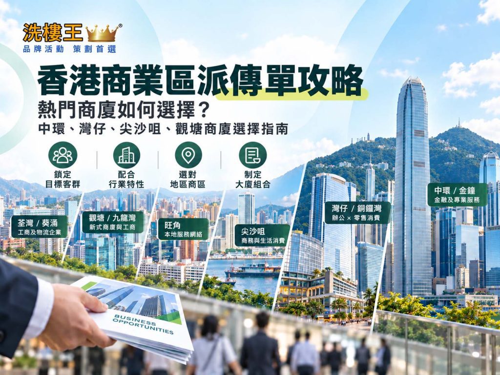
The real advantage of commercial building leaflet distribution lies in reaching the right companies and office workers within a targeted district. With the right choice of area and building mix, a brand can extend its reach while making sure its products, services, and offers are delivered to the audience that actually matters — which is why the goal should never be simply “more leaflets.”
Hong Kong’s business districts each attract different industries and workforces: Central is dominated by finance and professional services, while Kwun Tong is a hub for commercial and industrial SMEs. Before planning a commercial building campaign, businesses should first identify where their target customers are concentrated, then decide which districts and buildings to cover — rather than chasing distribution volume alone.
Four Things to Consider Before Choosing Commercial Buildings
Before mapping out a commercial building distribution strategy, businesses should clarify four key factors:
Target Audience: Are you trying to reach corporate decision-makers, professionals, or general office workers?
Industry: Finance, professional services, SMEs, retail, or IT and trading companies?
Location: Does your business have a geographic focus, such as serving only Hong Kong Island or East Kowloon customers?
Budget / Quantity: The number of leaflets to print and distribute determines how many buildings you can realistically cover.
Clarifying these four factors is the first step to identifying which commercial buildings are actually worth the investment.